
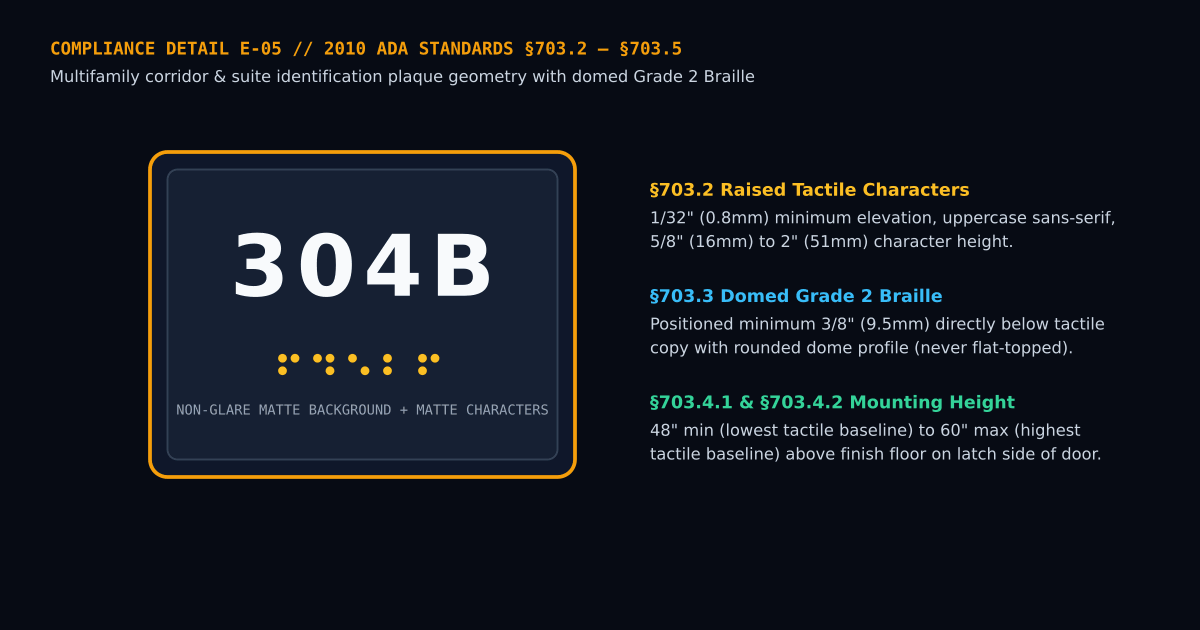
When renovating a 40-unit garden apartment complex, outfitting a mixed-use podium building, or commissioning condo corridor doors, decorative brass door knockers and glossy acrylic numbers mounted in the center of the door leaf frequently trigger Certificate of Occupancy holdbacks. Permanent room, stairwell, amenity, and residential dwelling unit identification signs in covered multifamily common corridors must satisfy 2010 ADA Standards for Accessible Design Section 703 (and state overlays such as California CBC Chapter 11B).
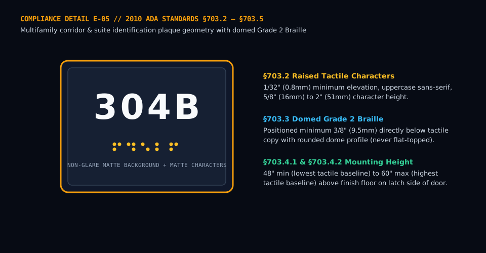
Do Multifamily Apartment Unit Doors Require Tactile & Braille Plaques?
Under the 2010 ADA Standards (§216.2 & §703), ICC A117.1, Fair Housing Act accessibility guidelines for interior public/common-use corridors, and state building codes, any sign identifying a permanent room or space along an accessible common circulation path—including numbered apartment unit entries, trash rooms, bike storage, electrical closets, mailrooms, fitness centers, and exit stairwells—must include compliant raised tactile characters accompanied by Grade 2 Braille.
Even where an older exterior walk-up building has partial exemptions, property managers standardizing corridor upgrades specify full §703 tactile + Braille unit plaques across the entire door schedule because modern photopolymer, raster-acrylic, and thermoformed architectural plaques cost virtually the same per unit while eliminating inspection re-work.
Exact Character & Braille Geometry Under ADA Section 703.2 & 703.3
Inspectors carry tactile gauges and Braille cell templates during accessibility walk-throughs. Every compliant unit number plaque must hit six dimensional targets:
| ADA Section | Requirement | Exact Dimensional Tolerance | Common Non-Compliant Mistake to Avoid |
|---|---|---|---|
| §703.2.1 Depth | Raised Tactile Elevation | Minimum 1/32 in (0.8 mm) above plaque background | Flat UV-printed or vinyl-cut stickers with zero physical relief |
| §703.2.2–.3 Case & Style | Uppercase Sans-Serif Only | 100% uppercase; zero italic, oblique, script, or decorative serifs | Luxury serif hotel fonts or mixed-case Apt 304b |
| §703.2.5 Height | Tactile Character Height | 5/8 in (16 mm) min to 2 in (51 mm) max (measured on uppercase I) | Oversized 4-inch decorative door numbers without separate compliant tactile copy |
| §703.2.6 Stroke Thickness | Tactile Stroke Width | Maximum 15% of character height (thin, finger-distinguishable strokes) | Chunky bold display letters whose strokes fuse under fingertips |
| §703.3.1 Braille Profile | Domed / Rounded Dots | Dot base 0.059–0.063 in; height 0.025–0.037 in; domed top | Flat-topped rotary-engraved dots or uncontracted Grade 1 Braille |
| §703.3.2 Braille Position | Clearance Below Text | Minimum 3/8 in (9.5 mm) below tactile characters, left-aligned or centered | Braille crowded right against numbers or placed above the text |
Wait—What If the Designer Wants Large 4-Inch Visual Unit Numbers?
Architects love bold 4-inch or 5-inch corridor numerals for visual drama, yet §703.2.5 caps tactile characters at 2 inches maximum so a blind reader can trace an entire digit with one fingertip! Section 703.2.5 Exception solves this cleanly: you may include oversized 4-inch+ visual numerals on the same plaque provided a separate, compliant 5/8-inch to 2-inch raised tactile + Grade 2 Braille line is also integrated in the 48-to-60-inch tactile reading zone.
Finish & Contrast Rules (§703.5.1): Why Mirror Brass & Gloss Acrylic Fail
Both the characters and their immediate background must feature a non-glare (matte, brushed-velvet, or eggshell) finish. Polished mirror chrome, high-gloss cast acrylic face-mounts, and specular lacquered brass create overhead corridor downlight reflections that wash out legibility for low-vision residents. Pair light matte characters on a dark matte plaque (such as brushed champagne-anodized tactile copy on matte obsidian acrylic, or crisp bone-white photopolymer on architectural bronze) to achieve 70 percent+ Light Reflectance Value (LRV) contrast.
Where to Mount Corridor Unit Plaques (§703.4.1 & §703.4.2)
- Never Mount the Required Tactile Sign on the Swinging Door Leaf: If someone opens the apartment door outward or inward while a visually impaired visitor is reading the plaque by touch, a door-mounted sign creates an immediate strike hazard. Mount the plaque on the wall adjacent to the latch side of the door.
- 48-Inch to 60-Inch Vertical Tactile Window: Measure
48 inches (1220 mm)minimum from the finished corridor floor/carpet to the baseline of the lowest tactile character, and60 inches (1525 mm)maximum to the baseline of the highest tactile character. - 18-Inch x 18-Inch Clear Floor Space: Ensure an unobstructed
18 in x 18 infloor square centered in front of the tactile sign, clear of the arc of any outward-swinging door by at least 45 degrees, and clear of hallway sconces, fire pull stations, or smart-lock keypads. - California Title 24 / CBC 11B Note: Projects permitted in California must specifically use California-spaced Grade 2 Braille cells (`0.100 in` dot-to-dot spacing vs. federal `0.090–0.100 in` range—meaning
0.100 insatisfies both federal ADA and California DSA/CBC simultaneously!).
Ordering Bulk Multifamily Door Schedules Without Costly Mistakes
When preparing a 20-to-300-unit building takeoff, export a clean spreadsheet separating unit plaques (`101`–`420`), directional corridor wayfinding (`<- UNITS 201-212 | ELEVATOR ->`), stairwell floor-level tactile signs (including roof access status), and back-of-house room plaques (`TRASH CHUTE`, `ELECTRICAL`, `LEASING OFFICE`), plus 3 to 5 percent attic-stock blanks for future maintenance replacements.
Need Sizing Verification or a Custom Plaque Quote?
Test your address on our Live Day/Night Halo Simulator or email your facade photo and street setback to info@housesignage.com.